ross warren
YOUTUBE REBRAND
In August 2017, YouTube underwent its first major rebrand since its launch, which included a new logo, typeface, and a site redesign.
The changes were designed to create a more unified, flexible, and consistent experience across all devices.
Working closely with the UX team and agency partners, I led YouTube Marketing’s involvement and rollout across 4000+ surfaces.
Key Aspects of the Rebrand
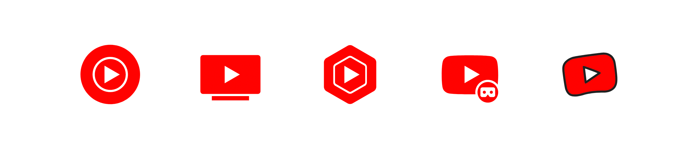
Logo Redesign: The most significant change was the logo. The word "Tube" was removed from inside a rounded red rectangle (symbolising an old TV screen) and placed the standalone, iconic play button to the left of the full "YouTube" wordmark. This change emphasised the core function of the platform and improved scalability and legibility on smaller screens, such as mobile app icons.
New Typeface: YouTube introduced a new bespoke font, moving away from the previous one. The new font featured lighter, sleeker lines designed for better readability and a modern aesthetic.
Updated Color Palette: The colour of the red rectangle changed to a pure, vibrant red (#FF0000), which designers explained represents the "RGB of video". The design team also implemented a red-to-magenta gradient to provide a sense of motion in elements like the video progress bar.
User Interface Overhaul: The desktop website and mobile apps were updated to align with Google's Material Design principles, resulting in a cleaner, less cluttered interface. The content was brought to the foreground, using fewer shadows and boxes.
New Features: The rebrand was part of a larger update that included new features rolling out across platforms, such as variable speed playback on mobile and an adaptive video player that adjusted automatically to vertical, horizontal, or square videos. A "dark mode" option for a light-on-dark colour scheme was also first implemented and released in August 2017.